
Are you loving it?
I’ve chosen an advert which is a bit left of field because I find it really interesting and very effective. I’ve had Macdonald’s food probably about three times in my life usually because someone else has wanted it. My very elderly Aunt likes Macdonalds apple pie and finds the young staff always very friendly and accommodating.
I avoid Macdonald’s because I see it as junk food but there’s maybe a snob factor also. Plus, as a big very dominant corporation, it doesn’t fit with my political leanings. However, the above advert appeals. Why?
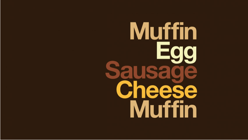
Signifier:
- Minimalist style
- Muted colours
- Abstract approach – have to work it out.
Signified:
- The minimalist style exudes confidence. It tells us that this brand is so iconic that we don’t need to be told what it is. It is universally recognisable. The font itself is ‘quiet’, not big impact because it’s so good, it doesn’t need to be.
- The colour palette is typically from the Pantone colour charts. The green below I would call ‘racing car green’ similar to Harrods green which elevates the ‘class’ of the product. This is the same for the blue and red-brown of the other two adverts. They are more regal and understated than the usual colours of the Macdonald’s marketing.
- The abstract approach appeals to a ‘higher level of intelligence’. It is to elevate the products to appeal to a higher social class.
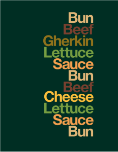

The truth is, it works very effectively. The adverts above are in stark contrast to the usual advertising from Macdonalds.
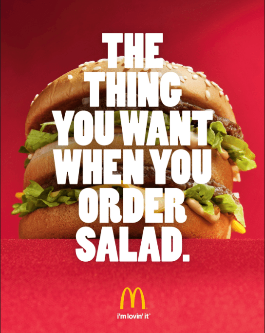
Signifier
- Subversive text
- High impact red colour
- Product elevated viewpoint and slightly obscured from view.
Signified
- Encourages the reader to ‘do what they want’, go against the rules.
- Red signifies energy, stimulates appetite.
- The product is something to reach for, almost sacred, an item of desire (on a pedestal).
